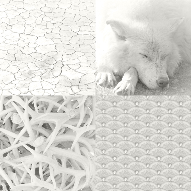
Pantone’s colour of the year is “Click Bait” and there’s nothing more 2026 than that.
For the love of a blank canvas!
Over the last few days, we’ve seen colour and design experts say our times are too grim for such a non-colour; that they look to Pantone for inspiration and to create an annual design revolution. Instead, disruption!
Things may be grim these days. A pale, grey time. But don’t we all love a new notebook? The chance to build upon a plain surface?
There’s no better time than now to step away from big business, AI, influencers, algorithms, shaping your choices. Use some individuality and human intelligence and paint over your greige kitchen in a wild colour, have your designer shape your business’ brand around your target market rather than a trend, and dress in whatever shade makes you feel good. Yes, even “billowy, balanced white” if that’s what moves you, seems right.
Do we need to look to Pantone? Shouldn’t it be our own activism that adds colour to our futures?
The experts saying Pantone is out of touch, may be right with regards to the 2026 choice, but they’ve triggered something. They are getting more coverage than ever. Clever!
How are you going to run with “Cloud Dancer”?