PARTNERSHIP MARKETING

Partnership Marketing

This fabulous corporate headshot was produced by Lisa DeNeffe Photography – a business we are lucky to work with from time to time.  The model is one of our long-time and favorite clients, Rosemary Camposano of Halo Blow Dry Bars and G3 Strategy.

Lisa and Halo have put together their services in such a great way.  Halo is offering a discount to Lisa’s clients on hair and/or makeup styling before their photo session.  And Lisa is offering Halo clients a discount on a corporate head shot package.

Both Halo and Lisa will send an e-mail campaign to their clients, so Halo will be introduced to potential new clients and vice versa.  There will also be printed collateral for display and hand-outs and the web page version of the Halo e-mail campaign can be linked to from blogs and social media.  At the least, each business is generating new in-coming links from credible sites to their own website for a nice search engine optimization boost.

Partnership marketing is a win-win situation.  Your business’ clients win as they get an introduction to a new service or business and they get a nice deal.  Your business wins with exposure, added brand recognition, and SEO.

MPS wins too!  We have the opportunity to work with these great businesses and we developed the e-mail campaign Halo will send.

And my Facebook post for Halo reached eighty Facebookers in the hour after being posted.

TIPS! Think about the types of services that would complement your business and would be of benefit to your clients.  This is such an excellent sample – what could be better than hair and makeup right before a photoshoot?  Find a partner:

  • with an over-lapping target market to your business,
  • with a nice-sized e-mail list and/or blog following,
  • with the ability or contractor able to bring about a quality e-mail campaign and print collateral,
  • and with your level of energy and commitment to work to maximize all possible marketing pathways to make the partnership a success.

Thanks for reading – Rachel
GRAPHIC DESIGN DONATION

Donated Graphic Design

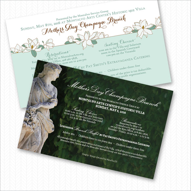
We are pleased to support the Montalvo Arts Center by donating graphic design and printing costs to the Montalvo Service Group.  It’s the most local to us of the non-profits we support. Each time we visit, we feel good knowing we’ve contributed to the preservation of this beautiful villa and grounds.

This year, we’ve produced two designs for the mothers’ day brunch fundraising event.  Wonder which they will choose?

If you would like to treat your mum to brunch next May, keep an eye on their website.

ARTIST LOU BERMINGHAM AND SHARING TO FACEBOOK

Artist's E-mail Campaign

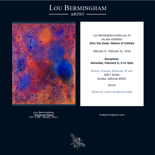
Abstract artist, Lou Bermingham as been a client of ours since 2008.  We’ve enjoyed each new work of art he has produced, visits to galleries and museums to see his work (and sip some wine at the opening receptions), and making a few web sites for him. There could not be a person more deserving of succeed in this competitive field.

We also send out e-mails to his quickly growing e-mail list. We keep them simple – just an image of one of his works and text to the right in an area that fits nicely into a smartphone screen without side-scrolling.

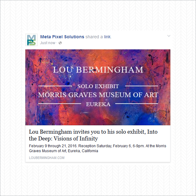
Lou is the ideal client with an ideal audience to include a “share to Facebook” link on his e-mail campaigns.

With an average list of a few hundred friends for each Facebook account, there’s the potential to get your product and brand under the noses of possible new clients.

Below is a sample of the above e-mail shared to the MPS Facebook page.

Interested in Lou’s art?  Visit his MPS website.

blog-facebook-sharer

SIGNAGE FOR NUEVA SCHOOL’S INTERSESSION

Nueva School Signage

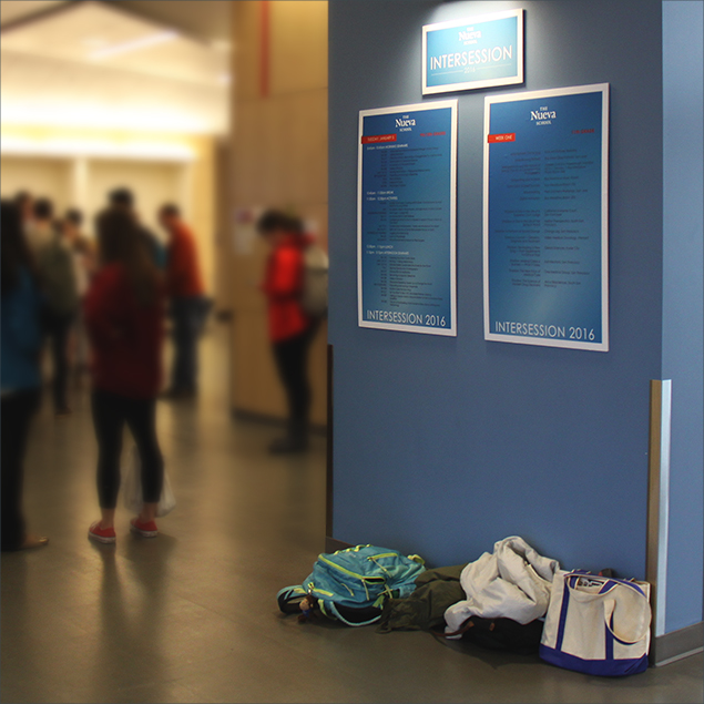
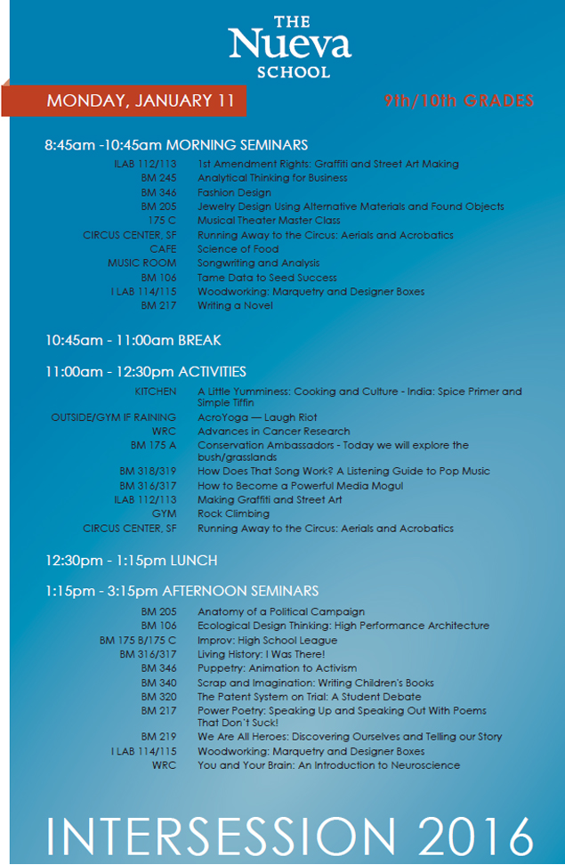
Over the last few weeks, we’ve been working with Hope Patricia Daly Public Relations on a class catalog and signage for Nueva School’s annual Intersession.  Intersession is a two week “experimental and intellectual feast” which engages the students in an interactive way on topics not found in typical high schools.  I’ve pasted a capture of one of the posters we made so you can see some of the amazing seminars and activities offered.

Thanks, Hope, for bringing us into this eye-opening project.

blog-intersession-signage2

TEAR-OFF REFERRAL CARD


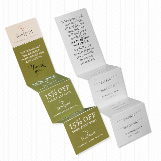
Tear Off Referral CardWe worked with a new printer, PrintingForLess.com, to make this referral card. (2025 updates – we still love this printer!)

Referral cards are difficult.  They need to be small enough that someone would carry it around.  Nice enough that people will pass them onto their friends.  They need to track the giver and the receiver so that the rewards can be passed on and so you can track your ROI.

Our client has been handing these out all holiday season.  We’re looking forward to finding out if they do bring in new clients – it’s a great offer for the giver and receiver, so they should.

E-MAILS WORKING FOR OUR CLIENTS

E-mail Campaign Design

(2025 review – funny how so much has changed since this 2015 post and how much remains the same.)

There are many ways to approach e-mail campaign development and production. We’ve narrowed it down to three options to cover all our clients’ budgets and all the devices out there.

We also include enhancements to our e-mail campaign services that our competitors skip. We usually do all the graphics and copywriting. For each campaign, we also produce a web page version which our clients use as landing pages for online ads or social media posts. A week after launch, we provide a free report on the campaign’s success.

And finally, because we don’t like to just do a one-off campaign with a short lifespan of value, we add the web page version to our client’s site on a news archive page so all that work put into making the e-mail campaign continues to pay off as a boost to site search engine optimization and additional information for site visitors to enjoy.

Reporting shows that around 55% of all our clients’ e-mail campaigns are being viewed on smartphones. This is a higher percentage for retail businesses and a lower percentage for B2B and service businesses. Because of this, the non-responsive e-mail campaign designs we were doing just a few years ago were dropped – a business’ e-mail must be readable and actionable on a smartphone.

Here’s what is working for our clients right now:

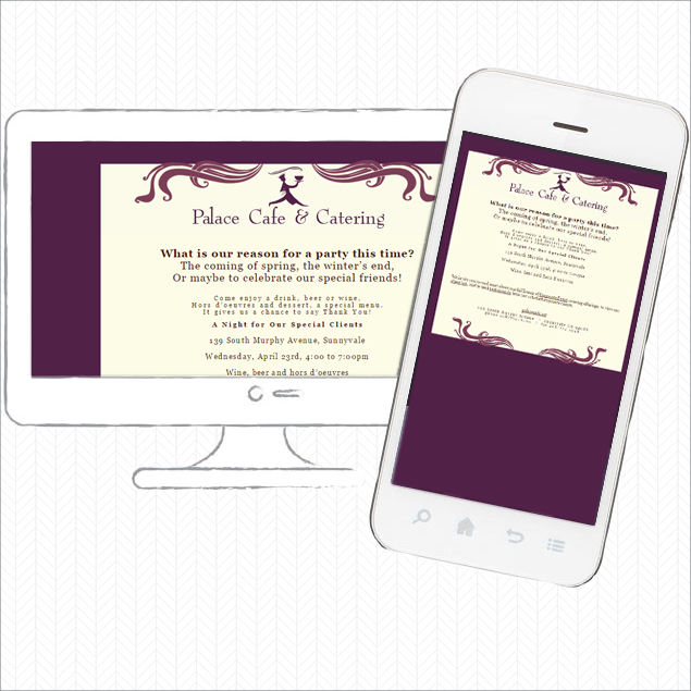
Mobile-friendly campaigns render cleanly, but not responsively, on all devices from smartphone (landscape and portrait) to desktop computer. These are the lowest priced options since they do not need complex responsive code or an e-mail campaign platform’s design interface.

They work well on all devices and on a smartphone do not require pinching or side-scrolling.

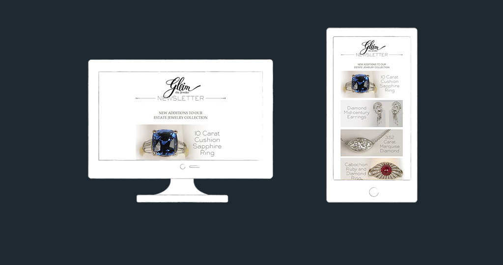
Here’s a mobile friendly e-mail campaign.

Mobile Friendly E-mail Campaign

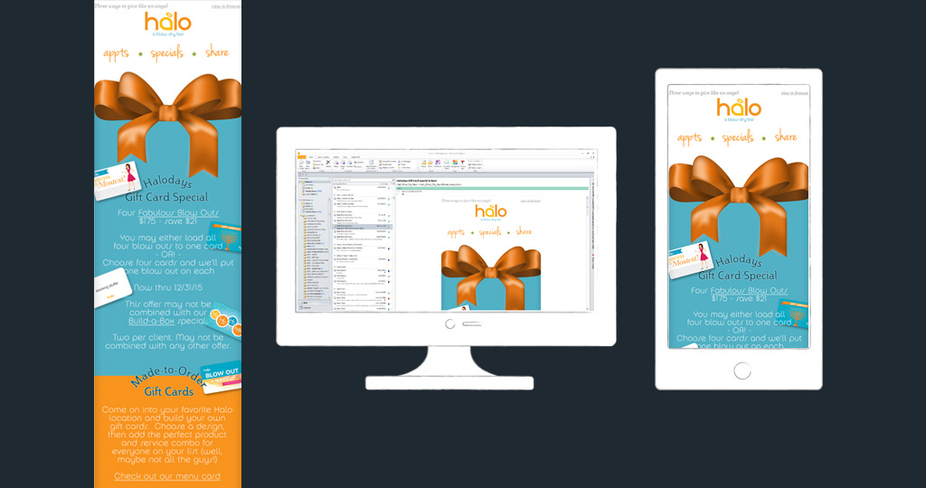
Responsive e-mail campaigns render the same code/design on any device. For these, we use a template provided by an e-mail campaign service provider, but prevent them from looking “from a box” with custom graphics.

Different e-mail campaign providers vary in quality and services. We like Vertical Response the best for its same-time-zone customer support and list management features, which we find to be the most adaptable to split-list campaigns and the way our clients wish to manage lists. However we have been recently surprised and pleased with how Constant Contact has improved – no more phone-tree nightmares when calling for support and great reporting. Of the main providers, MailChimp is our least favorite as the list management is non-flexible and there’s no phone support.

Here’s a sample of one of our responsive e-mail campaigns, produced through Constant Contact.

Responsive E-mail Design

Custom, responsive e-mail campaigns require a lot of work. Two versions of each campaign are produced: a desktop version and a smartphone version. These are the best looking and performing types of e-mails as the design is specific to the device.

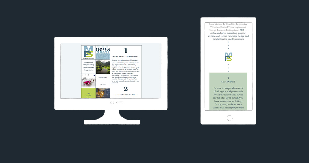
Our company campaigns are coded in this way.

Custom Responsive E-mail Design

We work closely with our clients to make sure we are providing the best fit for their needs, and their budgets.

Our e-mail campaign portfolio.

WHICH WEBSITE FOR ME?

Which Website?

(2025 Review – this post is not only interesting to anyone wondering about the time before responsive website code.)

WHAT ARE THE DIFFERENT TYPES OF WEBSITES AVAILABLE AT MPS?

Up until a few years ago, websites were static in that they displayed the same layout no matter the type of device upon which they were viewed. As you have all experienced, these sites do not work well on smartphones; the text is too small and screen pinching and side-scrolling is required.

Content Management Systems (CMS) sites allow for anyone with administration access to make basic edits. For example, putting in a new product photo or changing the business’ open hours. This always seems exciting to a business as they feel they will save money by managing the site internally, but all of our clients who have CMS sites pay us to work on them – work which costs more as edits are done in an interface, rather than using website coding software.

Mobile websites are coded completely differently from a business’ main site. It’s designed to render on smartphones in landscape or portrait modes and to feature information a mobile user is most likely to need. The main site continues to render on desktop and laptop computers and tablets. Mobile sites are “seen” as responsive by search engines.

A responsive website is designed to recognize the device the viewer is using and render the page’s content in the most attractive and readable manner by responding to the device’s screen size, platform, and orientation. This means the same website content will display at its best from desktop computer to laptop to tablet to smartphone.


WHICH IS BEST FOR MY BUSINESS?

We don’t push any particular type of site. We have experience and understanding of all types of website coding for businesses going back to 1999. As new technology is developed, we integrate it into our service offerings as soon as it is well–supported. (Many developers jump on selling new code too early, leading to websites that don’t function very well, have a short life, and cost too much.)

We clearly explain your options and by gaining an understanding of your needs, budget, and business goals, we can make a good recommendation. If we do code a responsive site for you, we use the well–supported codebase named Foundation, used by companies such as Yahoo! and National Geographic.


RESPONSIVE SITES SEEM THE BEST CHOICE. IS THERE A DOWNSIDE?

  • A user viewing a responsive site on a phone will see the exact same content as a user on a computer. Since phone users are generally visiting your site for different reasons than a user on a computer, you may wish to keep a separate mobile version of your site geared to smartphone users’ needs and behavior, instead of having a responsive site.
  • Responsive sites require more maintenance, testing, and security and Javascript upgrades since the technology and coding is newer and more complex. Whereas our non–responsive and mobile code can go months without needing attention.
  • Potentially slower page load time.
  • Generally a responsive web site is coded for smartphones first, so with computer users coming in second they may find the content over–simplified.
  • Coding and updating a responsive site is more expensive.


AND THE UPSIDE?

  • Users are now familiar with responsive websites and expect all businesses to have a site that functions well and looks attractive on all devices. Businesses with a responsive or mobile site are going to look current.
  • Search engines “grade” a site as being more worthy of higher organic search results if it is device-responsive.
  • Since the user will be viewing a site which performs perfectly on the device he is utilizing, they are more likely to move around your site, finding the information they are seeking.
  • We found the following info when we created a client’s website traffic report for October, 2015. It’s based upon visitors to one of their services pages, on a site without a mobile version. 67% of smartphone users — mostly iPhone and Android phones — bounced off the page without clicking a link to any other page versus a 43% bounce rate for visitors using a desktop computer, tablet, or laptop.
  • As of winter 2015, 30–35% of our clients’ website visitors are using a mobile device. Your numbers are probably similar. Since around one third of your site’s visitors are using a smartphone, a mobile version will give these visitors a better experience and therefore keep them on your site.
  • If you wish to link to a page and have a separate mobile website, you will need to note two links – one for mobile and one for regular.  For example, if you wish to link to your web page with your business hours, you’d need to call out the link for smartphone users and the link for non-smartphone device users.  With a responsive website, the same link will work for any device.


PHOTOSHOP FUN

Photoshop Engraveing

(2025 review – Rachel’s grateful for her two decades of Photoshopping before AI. There’s no need for HI [human intelligence] for a project like this anymore.)

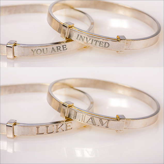
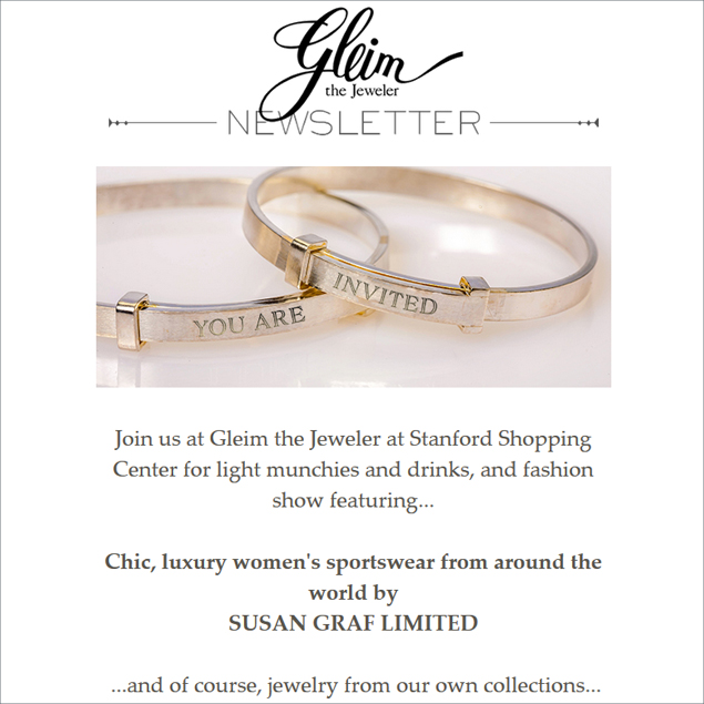
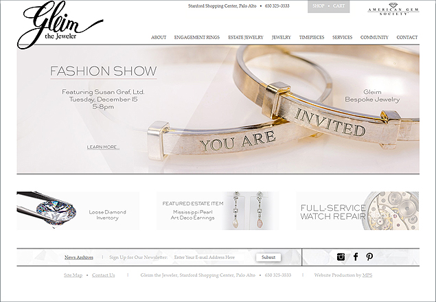
Love it when I get to play in Photoshop and make something that works for a client.  These custom bracelets by Gleim the Jeweler are perfect for the event invitation “engraving.”  So pretty as header for an e-mail campaign and for a home page slide.

E-MAIL CAMPAIGN HEADER:

blog-gleim-e-mail-campaign-graphic2

WEB SITE HOME PAGE SLIDE:

blog-gleim-e-mail-campaign-graphic3